I'll be designing for the the first photography festival in Kathmandu, Nepal. I'm thrilled. The festival will start in November, so I have some time to make this logo and branding spectacular. These are first-round ideas!
The above two I like, but they have zero relation to Nepal and they have that photo festival feel. I think sometimes you have to get the obvious design out of the way before you can start being creative.
The goals is a modern brand, but that stands by itself, regardless of prior knowledge of photo festival brands. This is difficult because photo festivals have pretty basic branding or they haven't taken the time to develop a brand at all.
We also wanted something with bright colors and strong lines. This year's theme is "time" and features archived photographs from the Nepal Picture Library. The photos will always speak for themselves - they are strong, incredible statements by themselves. I think the branding should draw attention to the photos, not take away from them.
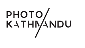
These are a few starting ideas. I apologize for the random shades of pinks and ocre. I think what's lacking so far, in the logo, is an element of Nepal. We wanted to include an element of Patan (the area where the festival will takes place this year). The temples, architecture and artwork in that area are spectacular and ornate. What I hoped to land on was a subtle, modern wink at Patan's unique architecture. The slash in the M mimics the temples' roofs.
This is just the beginning, so things may change, but I wanted to post a sneak peek at this exciting project. I will post more as we dive deeper!