

Section 01 / 05
Overview
Kraft Heinz is a $26 billion global food company with 200+ brands and 39,000 employees. My team designs the internal tools, dashboards and systems that 13,000 of those employees use every day to make business decisions. When I joined as a Principal Data Visualization Designer in 2022, there was no shared standard for how data should communicate insight across the business. The data experience practice I built four years ago is now in use across those tools.
Case Study
Team & operations impact
Product impact
" Sara is smart, patient, hard working, talented, and interesting. I think most people would enjoy working underneath her."
Section 02 / 05
Delish, Design System
I lead the data experience vision and visual language for Delish, Kraft Heinz's enterprise design system, working alongside a design system manager.
The problem
Kraft Heinz had 40+ internal products with no shared standard for how data should look or behave. Every team built their own charts, colors and patterns from scratch. The goal: a single, scalable source of truth for code, design and experience patterns, with 80% experience compatibility across every platform.
The approach
Through interviews with designers and engineers, we identified that the problem wasn't just inconsistent charts, it was that teams had no shared starting point. We built a visual language and set of data experience principles that defined how a user moves through a data experience and arrives at an answer: semantic color systems, chart standards, templates and component galleries.
The outcome
Delivery up to 33% faster across active product development teams. Accelerated time to market, increased capacity without adding headcount and a measurable reduction in experience and technical debt.
"I was able to reduce development time from 1 week down to 1 day with the new templates."

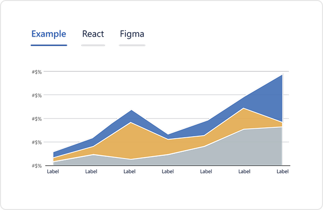
Chart component library
A library of 500+ chart variations built within Figma, Power BI, React and Angular
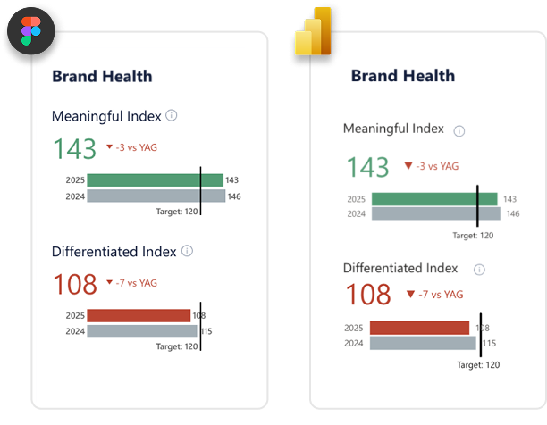
Figma to code fidelity
95% fidelity from Figma to development platforms (including highly customized Power BI dashboards)
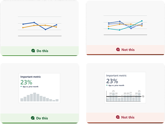
Easy to follow chart guidance
Documentation giving every team, regardless of skill level, a clear visual reference to get it right
Design as a growth engine

Section 03 / 05
My Leadership
When I inherited the Experience team, the first thing I did was a listening tour. What I heard most was a disparity between what leadership asked for and what felt possible. Designers didn't feel seen or heard. So I kept every one-on-one, listened more than I talked, cleared the path for good work to happen and made a point of recognizing good work publicly. That consistency built trust. The thing I'm most proud of is watching my team shift from pointing out problems to owning solutions.
"Sara Holcombe is fantastic. She is an exceptional communicator and motivator. Our interactions feel friendly and thoughtful and Sara genuinely improves my experience at Kraft Heinz."
on team engagement in 6 months, above company average.
Experience design
team's engagement score
leadership transitions My tenure 15 point lift, above average in
6 months under my leadership

Design Operations
I was one of the first hires on a brand new design team at Kraft Heinz. There was no Design Ops practice because there was barely a team.
As we grew, the gaps showed fast: designers and engineers worked in different systems with no shared language for handoff, stakeholders treated design as an execution resource and there was no standard for what "done" meant or what "good" looked like. Across three years I built systems across the three layers of Design Ops defined by Nielsen Norman Group: how the team works with others, gets work done and creates impact.
Business value framework
Design teams in large organizations often get handed tickets and asked to make things look good. I built a 5-minute framework to change that.
Every designer on my team runs it in a kickoff with PMs or agile leads to anchor UX work to a clear business problem and measurable outcome, in three slides, in under three minutes. The team learned to speak their stakeholders' language.
UX Metrics Practice
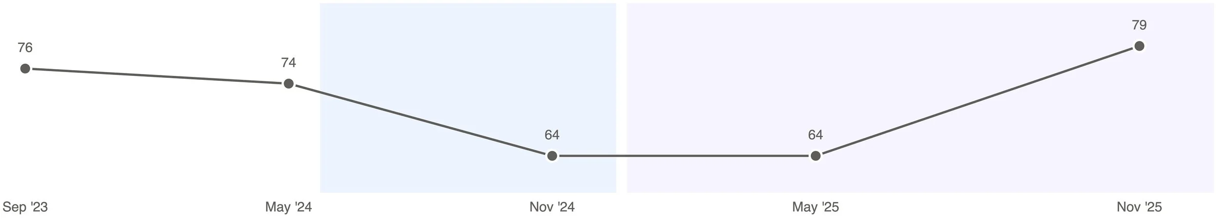
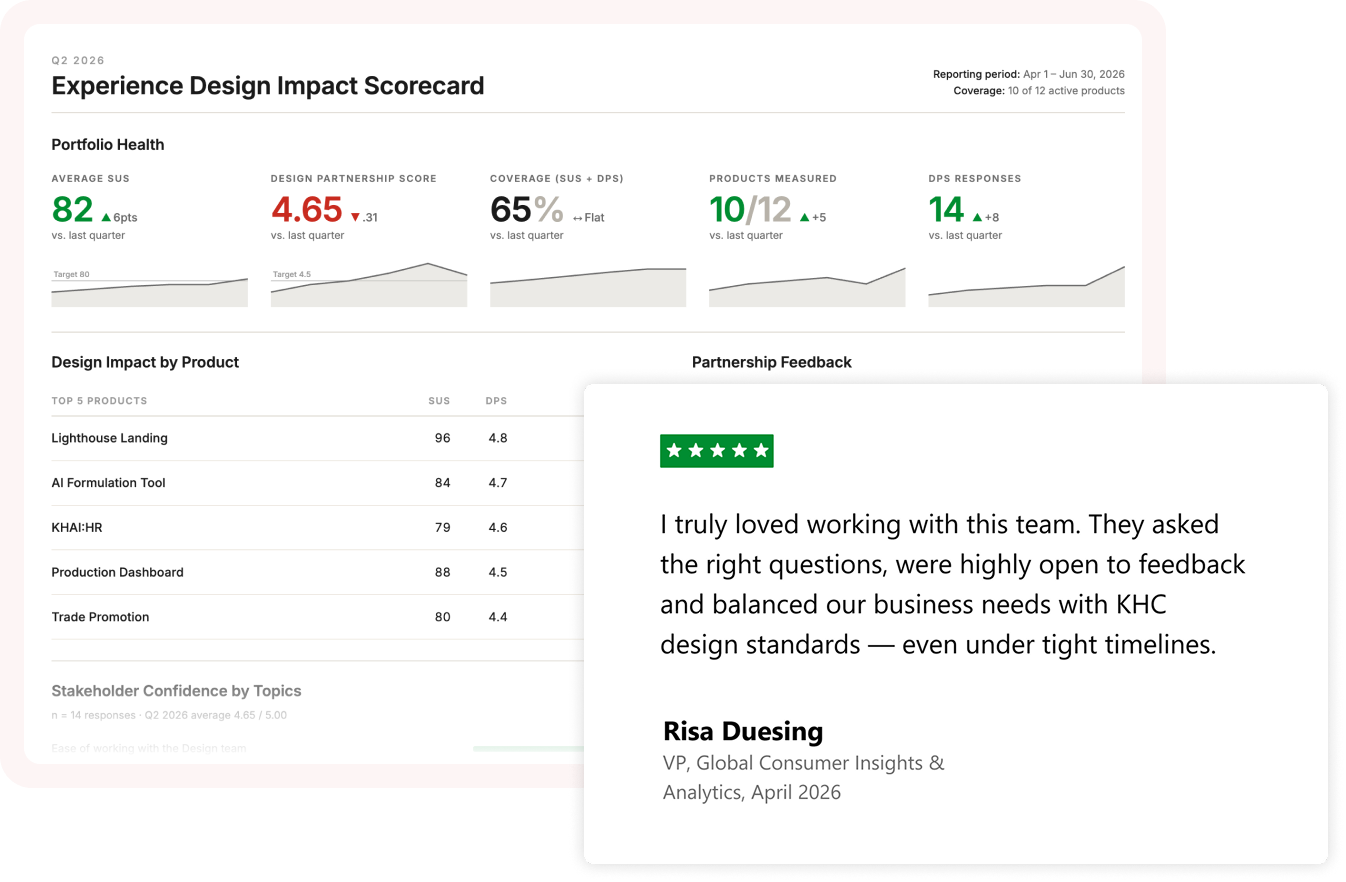
I built two metrics practices to quantify the value of UX. The first is SUS (System Usability Scale) testing with real users, run on every product the team ships and tracked over time so we can see whether changes are actually improving the experience.
The second is DPS (Design Partnership Score), a custom survey I designed to measure how well the team is partnering with stakeholders, PMs, engineers and analytics. Both run every 6–12 months and give the team early signal on what's working, where to invest more design time and where we're missing the mark with stakeholders.
Impact
Most of the work we do doesn't have a public face. It lives in internal tools, dashboards and systems that thousands of employees use every day to do their jobs. The standards and practices we built touch every one of those tools.
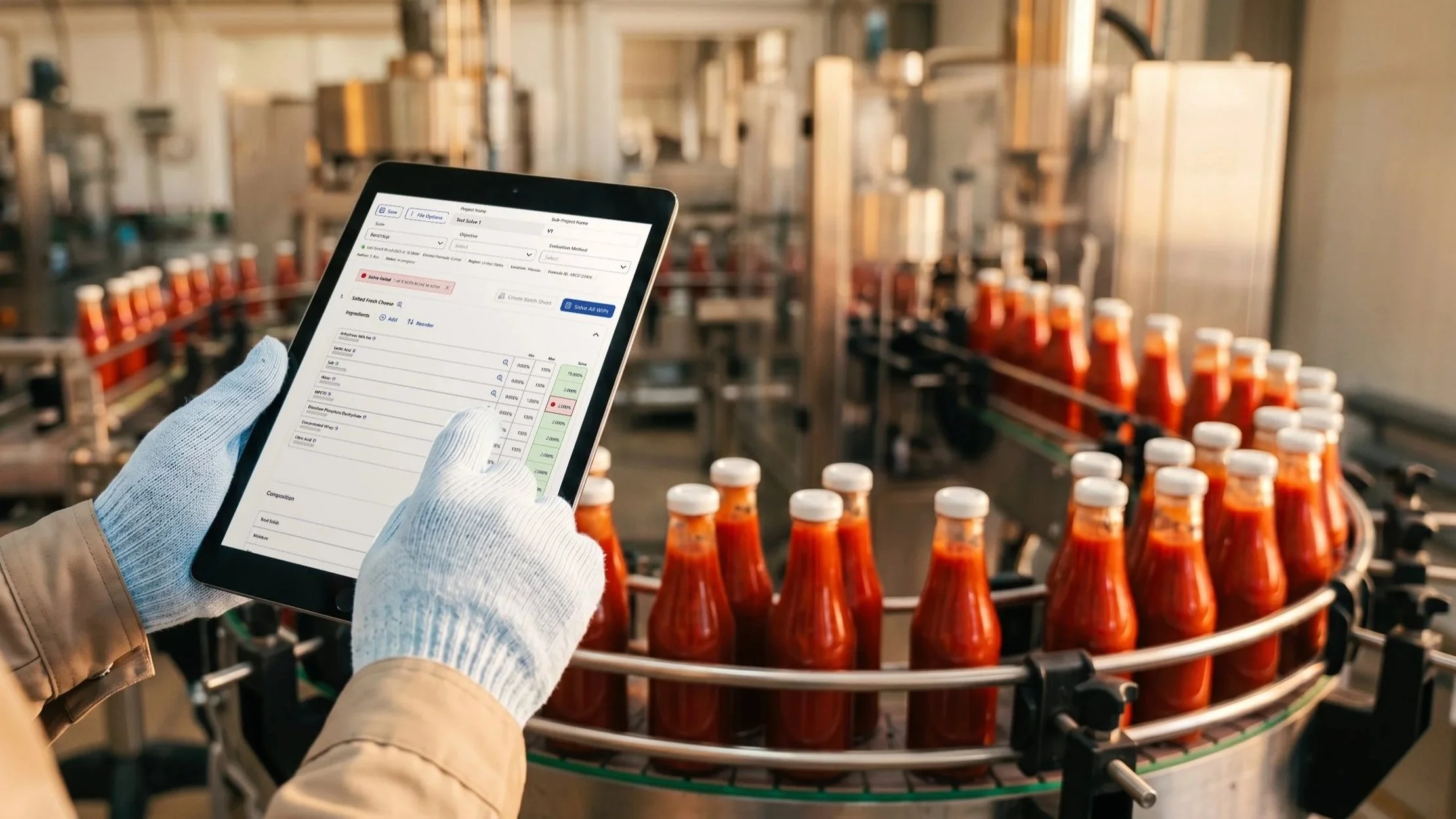
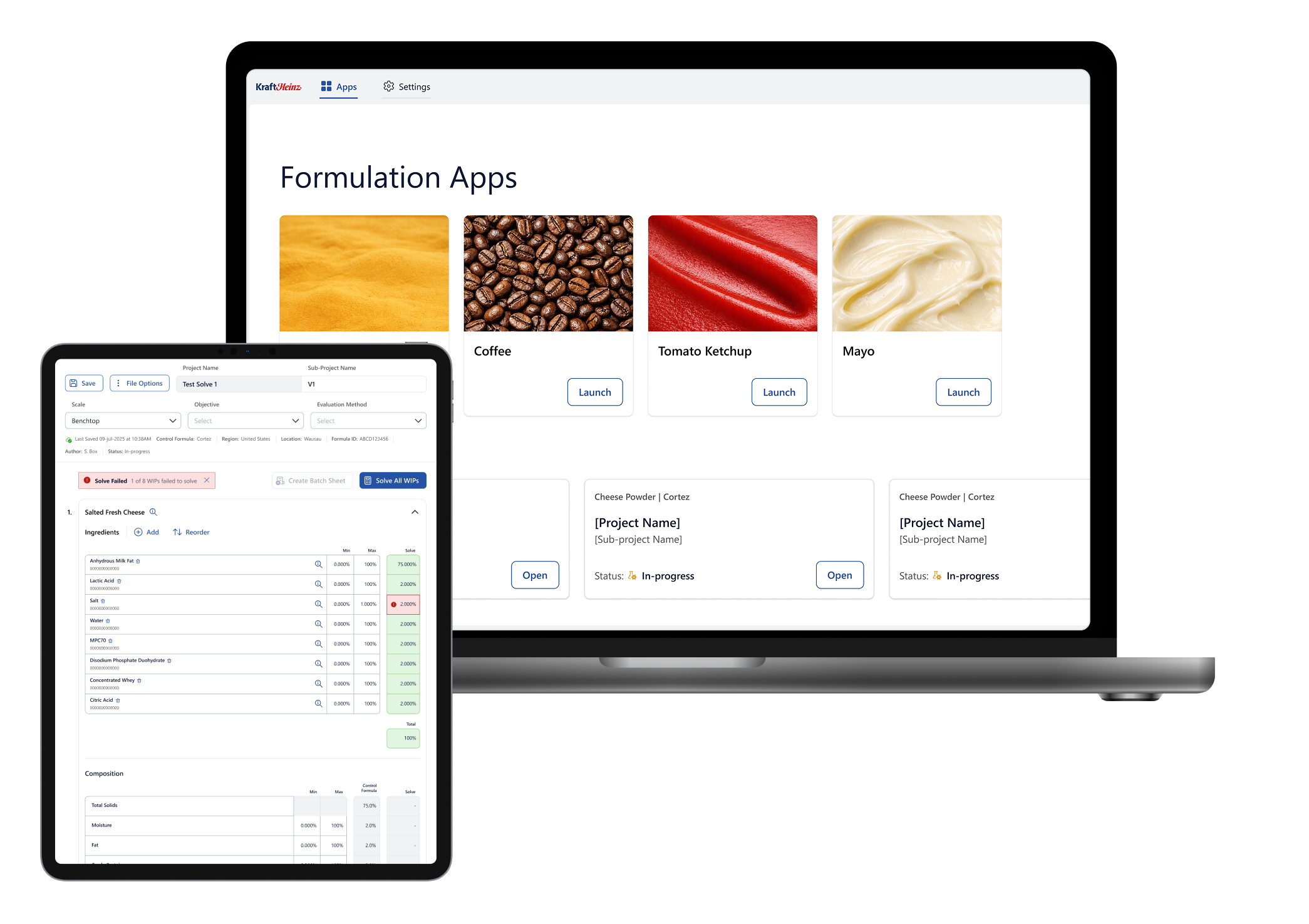
In 2026, Fast Company named Kraft Heinz one of the most innovative food companies in the world. Part of that recognition came from Leonardo, Kraft Heinz's AI-powered reformulation platform. Our team designed the Solvers, the experience that allows R&D scientists to model product reformulations at scale while preserving the qualities that define each product.
The Solvers helped reformulate Heinz Ketchup to reduce sugar and sodium without sacrificing taste, contributing to double-digit market share growth and removing more than 10,000 tons of sugar from the market. The technology has since been valued at $9.6M in realized value.
I'm so proud of Andrew Stump's senior designer expertise, relentless pursuit of the craft and together we contributed incredible value. But what I'm most proud of is building the team that helped ship this meaningful work.
"The design team has provided us with the most technologically advanced designs our pod has seen. They own the process and ask the right questions."