Clients Never Pick The Good Logo
You like these logos? You would. Well they didn't get picked by the client. I'm sharing my design process and take aways because I wish I could look at other designer's processes and know that I'm not alone.
PROJECT Logo and marketing materials for a garment center. They employ local ladies, teach them important skills and set them up with sewing machines and product designs.
PROBLEM The garment center has not been successful and they want it to be self sufficient, thus a logo and marketing scheme is what I'll be working on.
DETAILS The name of the new product label is Meanchey Designs. I started with a branding design questionnaire and a meeting with the client. I got the details on what they wanted and what they didn't want. Meanchey Designs will appeal to everyone, but the main audience will most likely be women from 20-forever. The words geometrically pleasing were mentioned.
What I learned and a few Take Aways
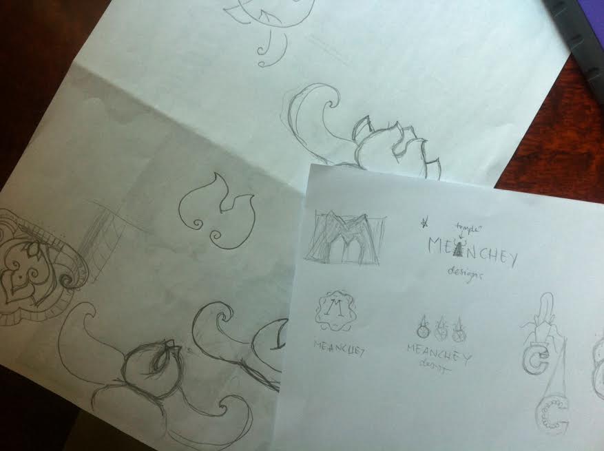
1. SKETCHING IS HARD I don't like sketching. I want to say that when I see other designers' sketches online I feel incredibly intimidated and inferior - now you too can feel good about your sketching abilities by looking at my sketches - you're welcome. Let's get this straight: I do not feel like an artist and I do not think I can draw or claim to be a drawer or an artist.
Sketching is good because it's harder delete your ideas (no Apple + Z available). The point is that I get ideas out on paper as soon as they pop into my head in visual form. I tell myself It does not matter if they look good. They're simply visual references for ideas and designs I may want to pursue later. At least that's why I sketch. None of the designs that panned out from my initial sketches were picked (top paper = initial sketch).
Take Away: sketches are like a bank of ideas.
2. INITIAL DESIGNS I sometimes cry alone at my computer over the death of an unchosen design. My first designs are NEVER chosen by my clients. They are often my favorite. But never the favorite of my clients. Ever. Ideas in the beginning of any project are sometimes spot-on (gut reactions are good) but most of the time for me, they're just mental poop - it is my mind's way of working out the cliche, what I see people doing on Dribbble, high hopes, and dream-come-true-design. I've found that once those initial designs are out of the way, knocked out of my mind, the real designing begins.
It sucks to hear that your favorite doesn't reeeeaaaally work. Take a day, listen to what the client says, ask more people (especially your friends who will tell you it's amazing and that the client is crazy), ask some more people, lay that little guy to rest and move on with your life.
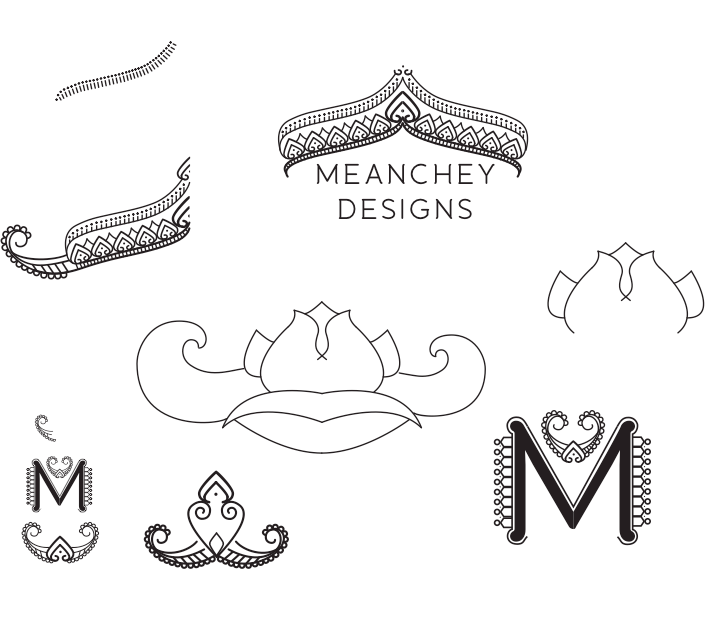
The bottom two are obviously not good and I knew it while designing them - they look satanic. Because I still like them, I will store them away for a future client who worships sun gods.
Rejection of the top one was harder to swallow. I love it. I (heavily) borrowed the design from my favorite tattoo artist. I can vomit up a million reasons why it should work: it's striking; women will be drawn to it because it's lady-like, but not too lady-like; it's generically Asian; it's versatile - both ancient and modern at the same time; etc. But the truth is: it's religious in nature and it feels too princess-y - both things the garment center is not going for.
Take Away: allow time for mind dump.
3. THE DIG Since the best design was rejected, I ask the client what would be a good symbol to work with or if I should just work with the letters M and D. They say fruit or flowers and lettering is okay. I dislike the idea of both flowers and fruit because it's a garment center. I tried lettering but I haven't taken those Lynda.com tutorials yet. So I decided to take on the flower idea after I saw the absolutely gorgeous national Cambodian flower.
I had THE hardest time. I couldn't get the line drawing style out of my mind and I felt that a flower would attract either Southern Women* or pugs. I kept trying. You can see both beautiful flower and nasty mess below.
*I love Southern Women.
I had another meeting with the client and confessed that I hate the flower. They continued to hate the crown drawing. We talked it over and I asked if there were any aspects they liked about the crown drawing they hated. It was a question I should have asked instead of getting butt hurt that they didn't like it. I asked if they liked the line drawing feel of it. They did. So I finally tried to merge what I liked about the crown drawing logo with the cute flower my client wanted.
Take Away: stop getting butt hurt and start asking questions.
4. POLISHING Most of the time my client wants a million different versions of all the designs. Luckily this client liked one of the options when I showed them the picture above. So really polishing this time was just taking the logo they liked and putting it in different colors, line weights, with different type fonts, textures and ideas to try and flush out what kind of color palette and style they want. Like this:
The below image is the logo they went with. I do not reeeaaaalllly like this logo. I don't think it's awful, but I don't love it at all. This logo is not for me. It's for my client. They like it. They think it will sell lots of pretty things. That's very important.
Take Away: in the end, it's not what you want, but what the client wants that matters.


