
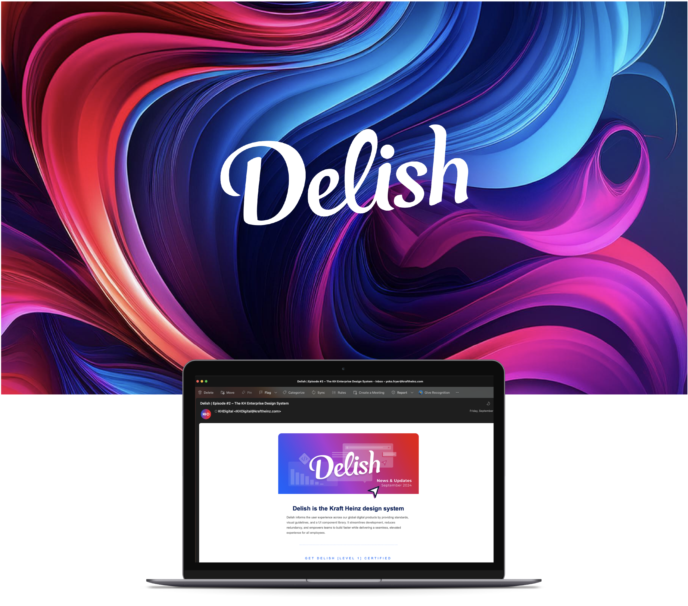
Delish Design System
Enterprise data-experiences at Kraft Heinz
The Delish Design System is more than a collection of components—it’s a bridge between data, action and impact. With over 400 custom chart components, templates across 3 products and a robust governance framework, Delish empowers teams to create consistent, actionable and visually compelling data stories.
2022-2024
Group Lead, Data Visualization
2025
Associate Director of Design, Global
Deliver 80% experience compatibility across all development platforms for the global workforce in a design landscape with no previous guidelines, inconsistent user flows and disconnected chart standards.
Lead a multidisciplinary team, creating a chart-heavy design system tailored for designers, BI engineers and end-users. Developed governance processes to ensure quality and innovation across the system.
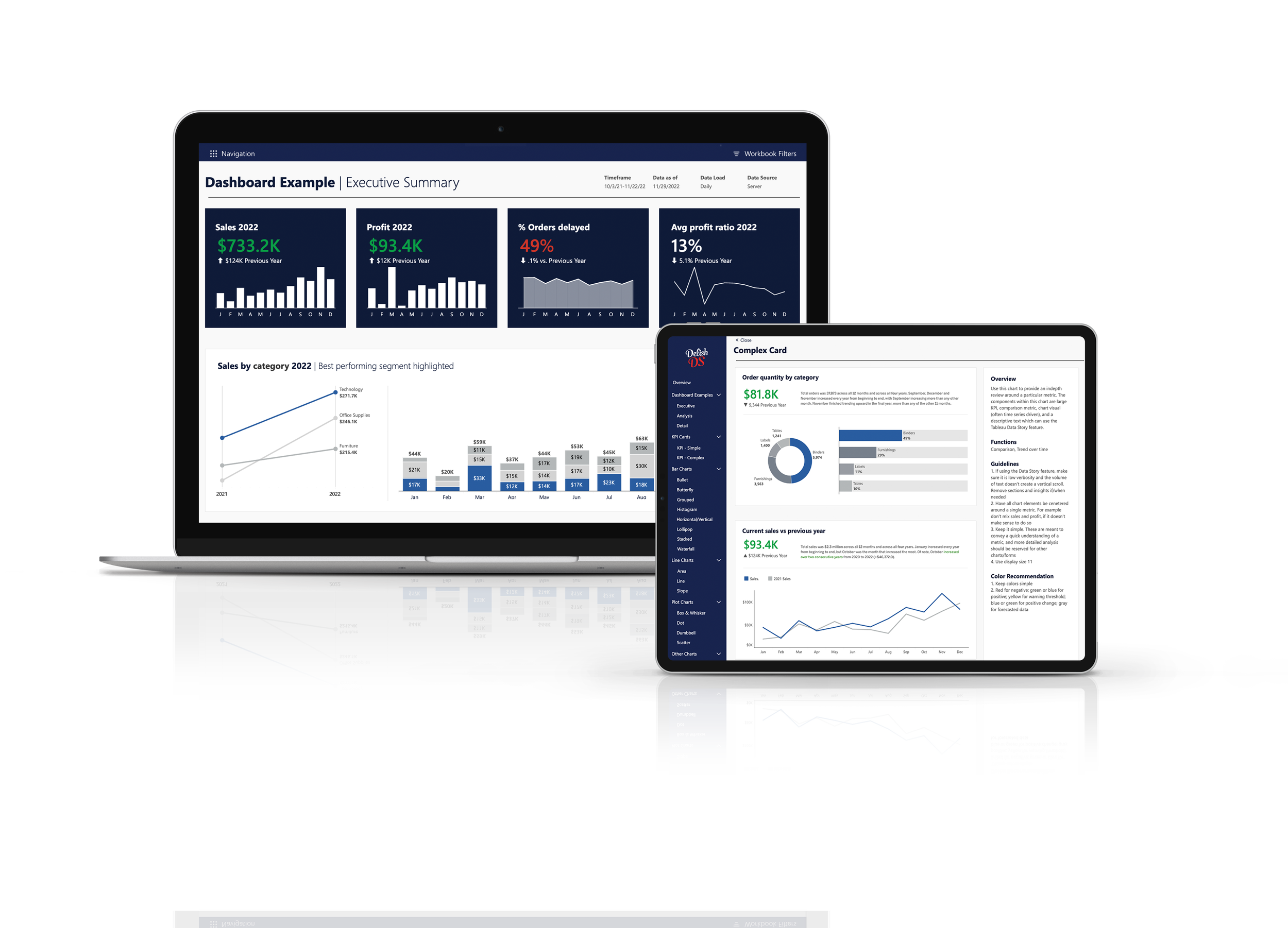
A comprehensive system of 400+ custom data viz components and templates, enabling consistency, efficiency and impactful storytelling across the enterprise.
With the help of my incredible data visualization team, including Steph, our design system manager, we developed over 400 custom charts and components. These tools form a rich library that sets Delish apart from traditional design systems.
We designed intuitive, platform-specific templates (PBI, Tableau, and Supernova) to streamline data visualization across Kraft Heinz. These templates ensure efficiency, standardization, and accessibility, empowering builder teams to create with confidence.
I designed and implemented the governance council, establishing structured processes through newsletters, meetings, and intake reviews. This ensures that Delish evolves with user needs while maintaining quality and consistency.
2022
How it started
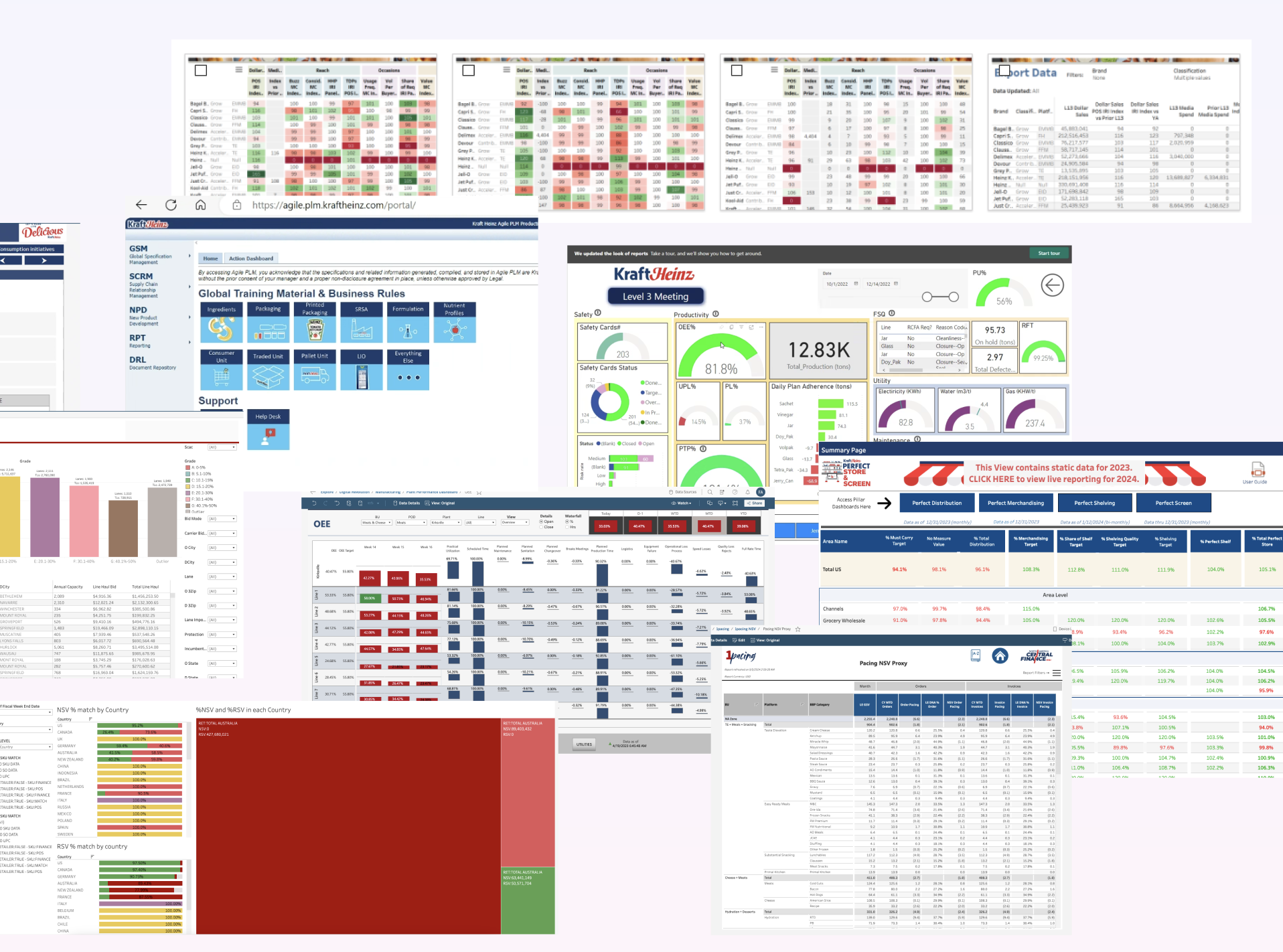
When the design team started, we faced a fragmented landscape—no guidelines, inconsistent colors, disjointed user flows and scattered chart types. Over the past three years, we’ve addressed these challenges, building a solid foundation that enables more cohesive user experiences.
Through user interviews with designers and business intelligence engineers, we identified the need for better data storytelling tools. We quickly realized that success wasn’t just about choosing the right charts—it was about designing solutions that empower business leaders to act on insights.
No design system existed
Thousands of digital products
Zero consistency
Lack of any user experience
Fluent foundation
2023-2024
Building the framework
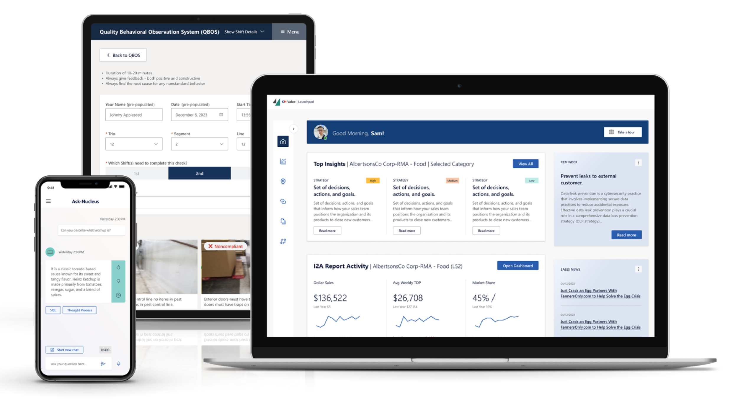
The design team entered a phase of rapid growth and standardization, establishing the foundations for consistency across our digital products. With a robust Figma library, detailed documentation and platform-specific templates, we rolled out a scalable governance model to over 800 creators worldwide. Our efforts included creating a data storytelling library, defining visualization guidelines, and implementing templates for Power BI and Tableau. The result was a cohesive design system, 38 reusable components, and five distinct color systems, all underpinned by emerging AI design patterns to enhance storytelling and decision-making.
40+ digital products, globally
Defining governance models
Rolled out to 800+ creators
Company-wide training
Data visualization library & guidelines
Templates for PBI and Tableau
38 components
5 color systems
Communication system
AI patterns established
2025
Shaping the future
Looking ahead, we’re focused on deepening the connection between brand values and user experience to create employee-centric designs that inspire and empower. By enhancing wayfinding through improved systems and patterns, incorporating animation, micro-interactions and motion, and driving code-based development, we aim to elevate design impact and increase adoption across the company. The future is about refining and expanding our work to ensure that every interaction is intuitive, impactful and aligned with the company’s vision.
Improve way-finding through systems & patterns
Animation, micro interactions and motion
Increase adoption
Code-base development
What Makes Delish Unique
Data Storytelling Focus
Our system prioritizes mapping out users’ mental models to present data clearly and cohesively. By understanding what users already have in their minds, we design tools that make complex information actionable.A Tool for Multiple Audiences
Delish serves designers, business intelligence engineers, and end-users, enabling each to contribute to and benefit from a unified system.Driving Real Results
This system isn’t just about creating charts—it’s about empowering leaders to make better decisions, improve efficiency, and drive impactful outcomes.
Visuals and Features
Data Visualization Library: A snapshot of key chart components and templates.
Process Video/GIF: Highlight Steph’s walkthrough of how Delish works.
Before and After Visuals: Show the transformation from inconsistent designs to standardized tools.
The Impact of Delish
Over the past two years, the Delish Design System has saved countless hours, improved data comprehension, and empowered teams to tell better stories. Its foundation of storytelling, standardization, and governance makes it an essential tool for decision-making at Kraft Heinz.
“I was able to reduce development time from 1 week down to 1 day with the new templates.”
“The cheat code we need in the org.”
“To be totally honest with you…I haven’t seen a better example of a company that’s systemically approaching what looks like a data visualization design COE across platforms like this.”