
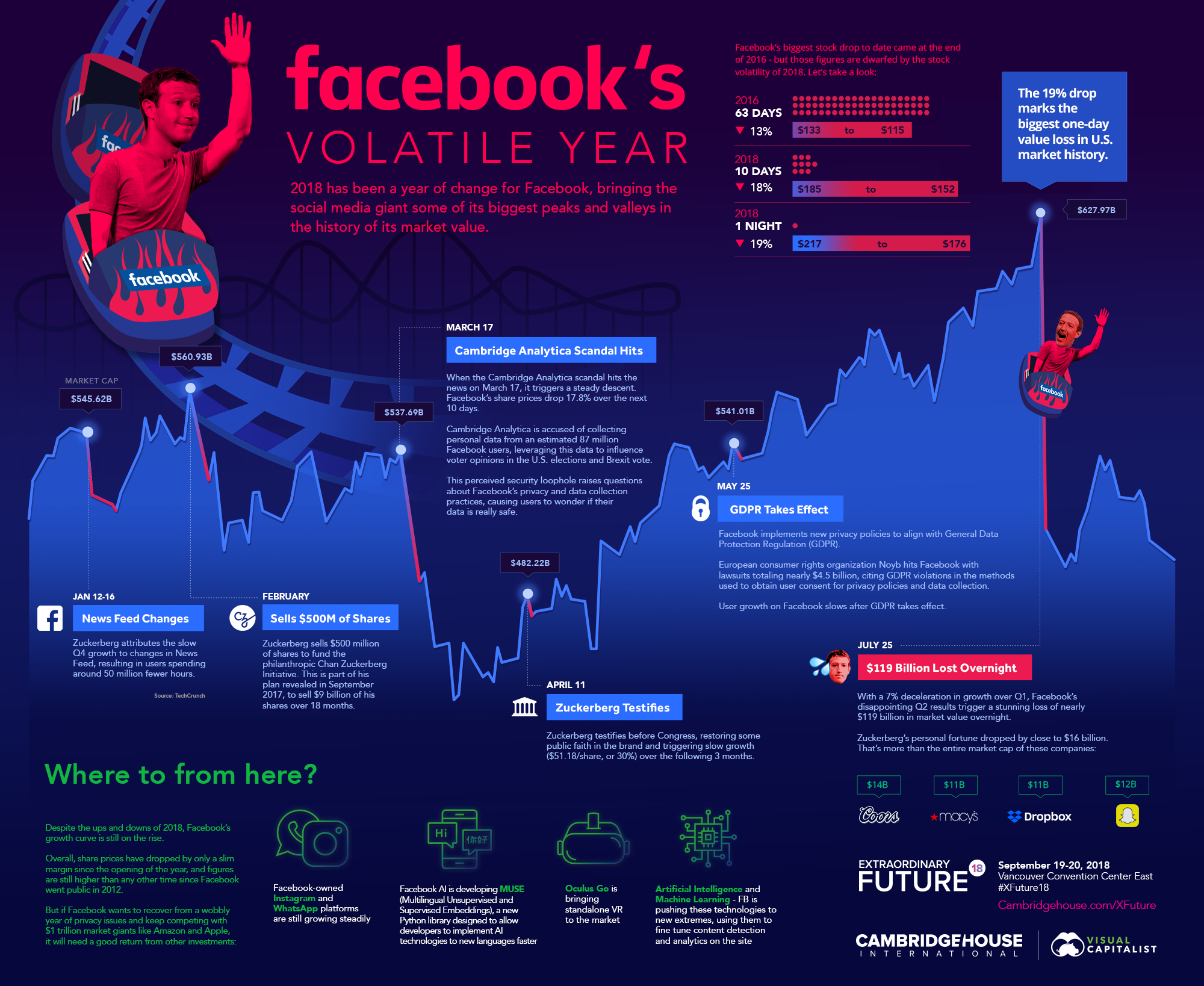
I recently worked with Visual Capitalist to create this piece about Facebook’s Volatile Year in the stock market and news. Take a look! I really enjoyed the design process and working with the team. They produce some great content, check them out.
Here’s a closer look at a few of my favorite custom icons and illustrations.
i went viral
Made a whole fleet of viruses for an infographic for the CDC. We're still developing the infographic or one-pager and when it's finished, I'll add that here. But I had such a good time designing these! I love the layers, the weird shapes, the colors. I enjoyed this so much more than I thought I would...


A Tribute: Books that Changed My Life
Before I post my Photo Kathmandu design work, I'm adding something I've been working on in my free time. I have been contemplating applying for grad school to study graphic design at Aalto University in Finland. You know you're doing something good when an assignment has you get-up-in-the-middle-of-the-night-to-jot-down-ideas excited.


For the application, the instructions were to make an 8-page, graphic design-oriented memoir style layout, with text. I'm not going to include the text because it's super personal, but I am posting my process and one of the four layouts. I decided to create very different layouts for 4 different books that impacted my life. I've always felt that I could define separate seasons of my life by books.
I could name way more than four books that impacted and changed my life. But I started with these four: Goosebumps by R.L. Stein (my father who passed away when I was 14 inspired me to read by buying me all the Goosebumps series I wanted growing up), The Bible (for over 7 years I was a self-inflicted, fanatic Christian), Jitterbug Perfume by Tom Robbins and The Passion by Jeannette Winterson (when I read this book I felt I was reading myself to me). The book and layout I was most excited about was "Jitterbug Perfume" by Tom Robbins. I read this book while questioning Christianity and traveling through Nepal. It opened my eyes to a world of living life to the fullest through travel and my mild version of debauchery.


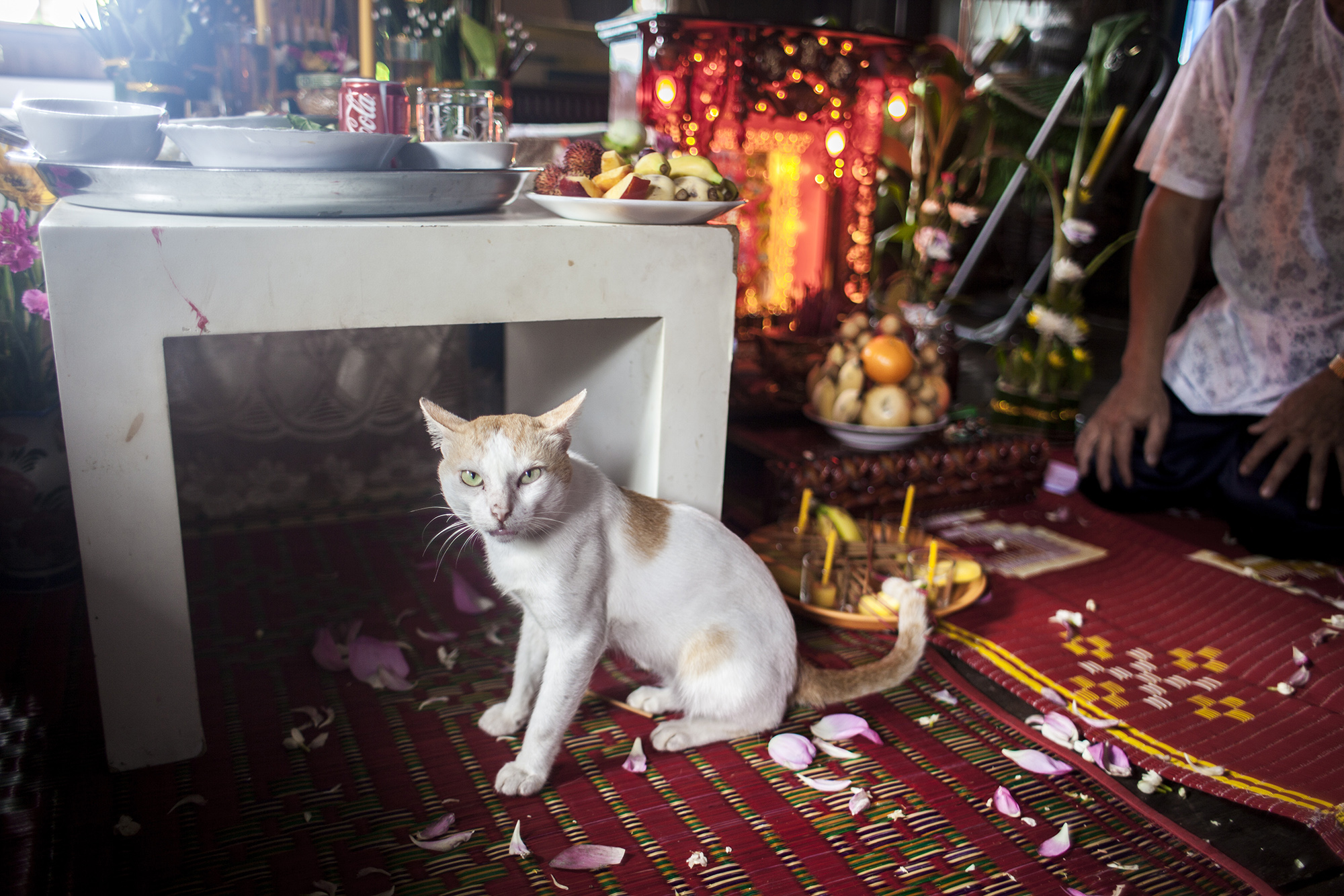
I knew I wanted something striking to fill the typography. One of the main parts of a classic Nepali puja is this bright mixture of dahi (yoghurt) and chamal (uncooked rice). Usually the last part of the puja is when the person blessing you puts a large clump of this mixture on your forehead. I was so incredibly surprised at how beautifully it worked. It really pops against the wood and because it's sticky and wet it really worked great.
Then it was time to gather all the puja items I could find around Kathmandu to create an arial photoshoot that I could then add my memoir text to. I used all very specific puja items. In Nepal, most cultures and people groups have their own puja's all year round that include different items. There may be a few pieces in here that don't go with this puja (the fish are not used in a Laxmi puja but I just loved those fish and also that pink wafer doesn't work, but it was just so pretty). But mainly they are all things used for this particular puja.

"soul shake down" an Exhibition for Nepal
When I found out how devastating the earthquake was that hit Nepal, I sobbed; I fretted; I was angry; I was out of my mind. I did not leave my computer for days, wondering how I can help, if I should fly there, what is the Nepali government doing, what am I doing here in Phnom Penh? I'd see a photo or a news clip and burst into tears.
I'm still bursting into tears, a month after.

All photos of the event by: Ashish Bajracharya
I was not surprised to hear how Nepali people and expats organized themselves one day after the earthquake hit. I was not surprised when I heard that a good friend of mine converted her hotel into an earthquake relief headquarter.
She's still working tireless long days, organizing day trips to villages that have been completely wiped out between tremors and more earthquakes. She calls it a "soul shake down." They started with phase one, search and rescue. Then on to phase two, aid and relief operations to the villages the government was not reaching. Now they are thinking long term, planning vocational training and workshops. These workshops will provide skills that will help in the coming years, post-earthquake.
It's strange to be in Cambodia when my favorite country (my home) is going through tragedy. I feel helpless and guilty. I was trying to invent ways I could help from here. When the Nepali government instituted a mandate, demanding aid money go to the prime minister's relief fund, smaller operations like NayanTara's group fretted that their funds might not reach them. I thought maybe I could fly in with massive amounts of cash to help...maybe not one of my smartest ideas.

An extremely nervous and choked-up me, talking about NayanTara, Nepal and the earthquake, surrounded by friends and people who love Nepal.
NayanTara presented her series "Being Nepali" at The French Institute a few months ago. She signed the photos over to me, hoping that I could roll them up and bring them back to Nepal or keep them myself. Turns out, the prints are glued to heavy boards, not easy to mount. I leapt at the opportunity to exhibit them here in Phnom Penh, post-earthquake.
Managing this exhibition has been cathartic and inspiring for me. My friends who are most likely sick of hearing me start sentences with "One time in Nepal..." have gotten involved. They came together and helped me organize this beautiful exhibition. Without the help of my friends and "The Plantation," this exhibition would not have taken place.
We raised money; we showed our support and love for Nepal; we candle light vigil-ed; we ate momos; we donated; conversations were had; tears shed; and we all looked at beautiful faces of Nepali people and drank and ate in the name of those we love, those we lost and those who are working so hard to rebuild Nepal.
I'm hoping Photo Kathmandu still takes place this year. It is too soon to discuss, especially since the location we were planning on exhibiting is now rubble. Maybe a photo exhibition about "time" is a great way for people to heal over this tragedy.

illustrations, oh my
Once upon a time...a young, bright-eyed, would-be photojournalist from small-town Alabama designed a brochure for a tiny NGO in Nepal. I never thought in a million years that I would be a designer. I never thought I was a photographer either, but that's not this story. What I always wanted, more than anything, was to tell and to hear stories.
Over the years, I've learned that the way we tell stories is just as important as the stories told. In the South, a good storyteller is as good as gold. My youth pastor could tell a story about a burrito that would leave you in tears. My Uncle Handsome relays stories with a southern drawl that drips with honey. His stories tell me who I am and where I come from. The way he delivers a story about my daddy and how he impressed all the girls, is just as important as the story itself. It's an art.
My designs, photographs, videos, typography, my media - I want them to tell stories. I may never be able to tell a story through graphic design with the finesse that my Uncle Handsome does. But I think the vehicle and the message should drip with honey like Uncle Handsome's stories.
I love communications because I never stop learning. Here are a few of my first attempts at illustration.

Here are a few characters I made for CCF. We're heavy on the great photography. Our CEO and founder is such a great photographer, so a few illustrations of people seemed like a good next step. I'm still working on these. This was one of the hardest things I've ever done. It took me nights upon nights, after work, to figure out how to do faces. I still don't think they're right. Let's call them a work in progress, for sure.
Above left, are icons I developed for CCF's new website. There are 6 major project areas with colored icons for each project area. I made a line version as well but I want to showcase those when I publish the website, which will be soon. For these icons I made several illustrations for each project area. Now, when I need to design a flyer for example, I can use illustrations as needed to make the media more dynamic.
These are trust badges for our Sponsorship Department for the new website. I think we need 3 more badges as well for the jobs and volunteer board pages. I'm looking forward to developing more of these as we need them for the website and other materials. Below is a personal project I'm working on where I illustrate friends' faces. This is the first one...hopefully more to come.
kathmandu photo festival branding
I'll be designing for the the first photography festival in Kathmandu, Nepal. I'm thrilled. The festival will start in November, so I have some time to make this logo and branding spectacular. These are first-round ideas!
The above two I like, but they have zero relation to Nepal and they have that photo festival feel. I think sometimes you have to get the obvious design out of the way before you can start being creative.
The goals is a modern brand, but that stands by itself, regardless of prior knowledge of photo festival brands. This is difficult because photo festivals have pretty basic branding or they haven't taken the time to develop a brand at all.
We also wanted something with bright colors and strong lines. This year's theme is "time" and features archived photographs from the Nepal Picture Library. The photos will always speak for themselves - they are strong, incredible statements by themselves. I think the branding should draw attention to the photos, not take away from them.
These are a few starting ideas. I apologize for the random shades of pinks and ocre. I think what's lacking so far, in the logo, is an element of Nepal. We wanted to include an element of Patan (the area where the festival will takes place this year). The temples, architecture and artwork in that area are spectacular and ornate. What I hoped to land on was a subtle, modern wink at Patan's unique architecture. The slash in the M mimics the temples' roofs.
This is just the beginning, so things may change, but I wanted to post a sneak peek at this exciting project. I will post more as we dive deeper!

fringe photo
I shot a World Housing opening last night and I happened upon these guys, wallowing. They looked pretty happy and comfy. I heard them rooting around and I saw them through the fence. Great photos hide in the fringes.


Women’s Day Campaign and A (refresher) Lesson
For International Women’s Day, I worked with our fundraising and video team to create a brand-awareness campaign for CCF. We wanted to show the breadth of what CCF does through the stories of four women. The name of our organization is Cambodian Children’s Fund, but our work goes far beyond helping children.
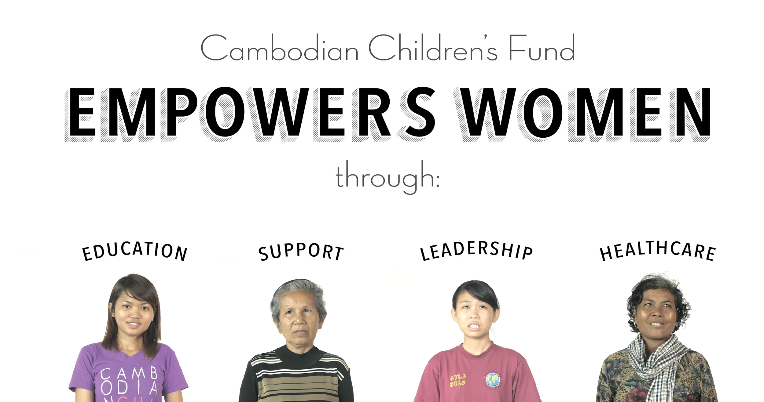
CCF has six areas of focus (leadership, community outreach, healthcare, childcare, education and vocational training). Within these six programs, over 60 activities fit into them (nutritious bread program, free dinners, clean water, dental care, college education, we even built over 200 houses last year and plan on building 300 more this year). CCF does so much for the people of Steung Meanchey! I am pretty often overwhelmed when trying to explain CCF to friends or acquaintances.

the design that went with the Facebook post of the Granny Sponsorship video
Lately our team has focused on explaining how CCF is more than just a children's organization. This campaign was one of our first organized attempts at showing our audience the breadth of the work we do.

the format I used for the statistic overlays within the video
While the 4-part video and design campaign was successful (over 200 shares, 3k engagement and a 94k reach), it was not as successful as other campaigns we’ve done in the past. It was unique in its approach and It was definitely something that most of our viewers and audience have never seen from CCF.
While producing this, we wanted to specifically showcase the statistics and impact of the work CCF is doing. We wanted to give concrete evidence of the impact of the work we do on the ground here in Phnom Penh.
I personally wanted to create beautiful typography, design and video to explain our impact. We did all these things and we did them successfully. But what I think this campaign lacked was a direct connection with the women who are featured in it.
The biggest take away for me was a reminder of the most important lesson I learned in college while studying photojournalism: people connect with stories. The strongest tool CCF has in communicating the impact of our work is the stories of the people we have helped. In 2015 (only 3 months in), the Facebook post with the most engagement and biggest reach had only 2 sentences and a before and after photo that showed a tiny girl enrolled in CCF. That simple photo-post diptych had over 3.3k likes, comments and shares. It had a 100,000-person organic reach.
This year we have many campaigns planned and although this campaign wasn’t as successful as I wanted it to be, by taking a risk and producing high quality media, we learned that leading with stories and keeping things simple will always have a great impact on CCF’s audience. We also creatively told over 94,000 people that CCF is more than just a children’s organization. That is important.
Working on this campaign was so much fun. I storyboarded, illustrated, collaborated with our incredible grant writing team, helped our film team shoot these ladies on a white background, edited 5 videos, created the typography by hand and I even did the tiny animation work at the beginning of the videos. This is what I love doing: combining photo, video, animation and design to tell stories that people connect with. I was up until 12 am one night doing the typography and I thought to myself, my job is so cool…

storyboards for the video

Generational Change
These are a few photos I took during a CCF house opening. CCF partners with World Housing to provide low cost housing to the communities who need it most around Steung Meanchey. For this house opening, we gave a house to an older couple who were living in a horrifying situation before we found them. You can read more about their story here.

Building (Internal and External) Communications
For the past six months I've been redesigning, rebranding and revamping internal and external communication and marketing materials for one of the most unique program areas of CCF: The Sponsorship Department.
The confirmation email that leads sponsors to a Resource Center, a website platform designed specifically for new sponsors to find resources and answers to questions they have.
I say unique for many reasons, but the main one I'm referring to when I tell people about CCF's Sponsorship program is that it is a one-on-one relationship with an actual child who goes to school at CCF. If a sponsor stops communicating after a certain amount of time, we basically find new sponsors for that child. Sponsors can meet their sponsor kids, in real life (no scams here), in Phnom Penh, see where they go to school, take them out for pizza, etc. The kids build lifelong relationships and friendships with their sponsors and their sponsors families'. I've seen kids during a Skype date with their sponsor families and it's moving. It is one of the best programs we run, in my opinion.
The best part about this project and my daily work at CCF is that I get the chance to use all my skills on almost every project. For this particular project, I used a few of the following skills: design, photography, video, web design, managerial, strategic development and marketing. Here's a breakdown of some of the work I produced on this project and a few of my thoughts.
1. INTERNAL STRATEGIC COMMUNICATIONS PLAN
I wasn't given a task to redesign our sponsorship department. As with most NGO's and the inner-workings of departments within them, there are almost always improvements just waiting for some overzealous employee to take on. I knew I wanted to brand and give an identity to some of the departments of CCF. In order to rebrand, I realized how much I'd have to dig into the pre-existing internal communications in order to produce marketing materials that made sense for Sponsorship.
I worked closely with the Head of Sponsorship to pinpoint areas of communication which needed improvement, both internally and externally. I set up surveys for existing and new sponsors in order to understand weak and strong points of past communication avenues and how we could improve them for future growth. We used these weak areas to restructure the internal communications workflow and created a new strategic communication plan. This took many interviews and meetings with key individuals including in-the-field staff and managers.
COMMS PLAN VISUALIZED Below is an example of the way I used design as a tool for our staff to help everyone visualize the new Sponsorship Communication Plan. This design was used to explain to employees their new roles and timeframes for each task so that there was less confusion when we rolled out the new process. I've deleted and abbreviated most of the information in the graphic below.

2. BRANDING FOR THE FUTURE
One of my biggest concerns in giving an identity to the Sponsorship department was making sure it was developed in a way that would allow other departments the option of branding so that they would all seamlessly fit together under the existing CCF identity.
Obviously an in-depth rebranding should be done at CCF with multiple branding elements and goals in mind. We will be redesigning our website and branding later.
There really isn't anything deep about how I did this. I picked a color that works in our current branding guidelines, played with a bunch of hand drawn fonts, drew my own, incorporated parts of the current CCF logo and put it together. The key here was making sure other departments (such as the Volunteer department - coming soon!) could also follow suit with the hand drawn feel.
This is one of the iterations of the logo we ended up with. The graphic below is the one I used as the opener to the video, welcoming a new sponsor. I used it in several other spots throughout the identity rebranding.
3. SAVE THE PLANET One of the most important complaints/suggestions we got from our survey was to stop wasting money and paper on physical leaflets and packages. Our old system was set up to send a physical folder in the mail, from Cambodia, with a photo of the newly sponsored child, a DVD of our CEO thanking the new sponsor, information about CCF, policies and other important info. Sometimes this packet would arrive 3 months after it was sent and sometimes not at all. One of my biggest tasks was breaking this packet down into a "Digital Sponsorship Package" which we eventually called the Sponsor Resource Center.
The Sponsorship Resource Center is a place where new sponsors can come to access any and all information regarding sponsorship at CCF. I took the photos, did the design and produced the video. I love this part of my job. Below is a final version of the design:

4. PRINT MATERIALS
One of the things we didn't want to lose with the new rollout, was the feel of being in Cambodia while communicating with sponsors around the world. Who doesn't like to get a package from a far away land? So I redesigned a few materials that will stay as part of the physical contact we'll make with sponsors and potential sponsors.
This is the outside. I will try to post a printed picture soon. It's confusing.
This is the inside. All names and information have been changed for the child's security.
Turning 30 in Cambodia
A little birthday bash in a Phnom Penh village...


Housing for a Community
The organization I work for provides affordable necessities to a small community of people in Cambodia who live near and sometimes on a trash heap in Phnom Penh. One of the things we offer is extremely affordable housing. They have teamed up with World Housing, a non-profit based out of Canada, to build almost 200 homes this year. They asked me to shoot a few houses in the process of being built.

Images In Infographics
I've been working on this technique where the photojournalist in me slaps the designer in me. As a photographer, I know the power of images but as a designer I neglect images because of how jarring a photo can feel in a graphic design, especially when it comes to infographics.
Designing with images is all or nothing. I used to either let them tell the whole story, simply, or not use them. Throwing a border on a photo or cutting it out as a circle feels cheap, leaving the designer in me feeling cheated.
This is my challenge - use storytelling images in a powerful, not forceful way in conjunction with my designs. Here are a few examples of how I've been trying to make this happen...does my use of images in my designs work for you?


Clients Never Pick The Good Logo
You like these logos? You would. Well they didn't get picked by the client. I'm sharing my design process and take aways because I wish I could look at other designer's processes and know that I'm not alone.
PROJECT Logo and marketing materials for a garment center. They employ local ladies, teach them important skills and set them up with sewing machines and product designs.
PROBLEM The garment center has not been successful and they want it to be self sufficient, thus a logo and marketing scheme is what I'll be working on.
DETAILS The name of the new product label is Meanchey Designs. I started with a branding design questionnaire and a meeting with the client. I got the details on what they wanted and what they didn't want. Meanchey Designs will appeal to everyone, but the main audience will most likely be women from 20-forever. The words geometrically pleasing were mentioned.
What I learned and a few Take Aways
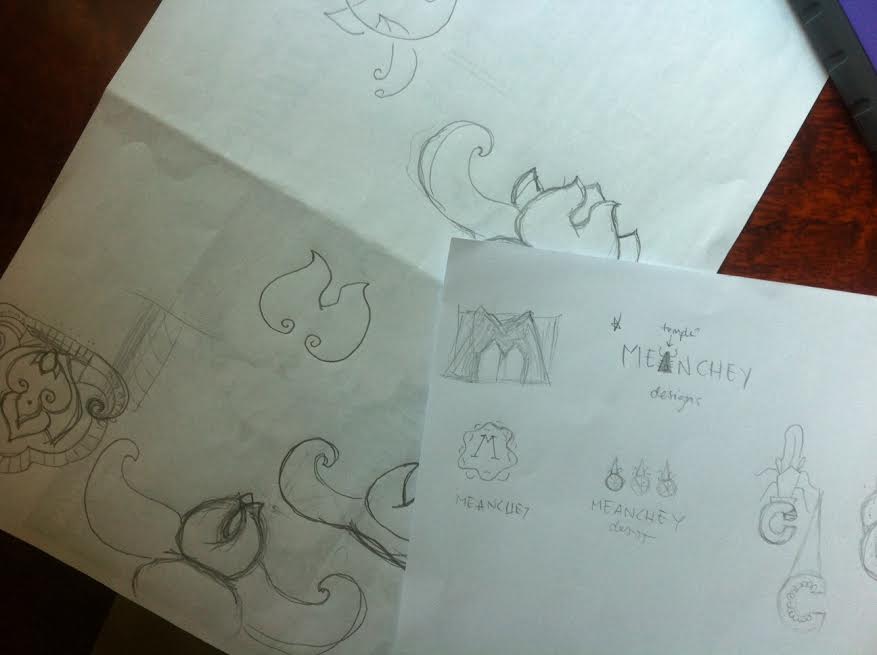
1. SKETCHING IS HARD I don't like sketching. I want to say that when I see other designers' sketches online I feel incredibly intimidated and inferior - now you too can feel good about your sketching abilities by looking at my sketches - you're welcome. Let's get this straight: I do not feel like an artist and I do not think I can draw or claim to be a drawer or an artist.
Sketching is good because it's harder delete your ideas (no Apple + Z available). The point is that I get ideas out on paper as soon as they pop into my head in visual form. I tell myself It does not matter if they look good. They're simply visual references for ideas and designs I may want to pursue later. At least that's why I sketch. None of the designs that panned out from my initial sketches were picked (top paper = initial sketch).
Take Away: sketches are like a bank of ideas.
2. INITIAL DESIGNS I sometimes cry alone at my computer over the death of an unchosen design. My first designs are NEVER chosen by my clients. They are often my favorite. But never the favorite of my clients. Ever. Ideas in the beginning of any project are sometimes spot-on (gut reactions are good) but most of the time for me, they're just mental poop - it is my mind's way of working out the cliche, what I see people doing on Dribbble, high hopes, and dream-come-true-design. I've found that once those initial designs are out of the way, knocked out of my mind, the real designing begins.
It sucks to hear that your favorite doesn't reeeeaaaally work. Take a day, listen to what the client says, ask more people (especially your friends who will tell you it's amazing and that the client is crazy), ask some more people, lay that little guy to rest and move on with your life.
The bottom two are obviously not good and I knew it while designing them - they look satanic. Because I still like them, I will store them away for a future client who worships sun gods.
Rejection of the top one was harder to swallow. I love it. I (heavily) borrowed the design from my favorite tattoo artist. I can vomit up a million reasons why it should work: it's striking; women will be drawn to it because it's lady-like, but not too lady-like; it's generically Asian; it's versatile - both ancient and modern at the same time; etc. But the truth is: it's religious in nature and it feels too princess-y - both things the garment center is not going for.
Take Away: allow time for mind dump.

3. THE DIG Since the best design was rejected, I ask the client what would be a good symbol to work with or if I should just work with the letters M and D. They say fruit or flowers and lettering is okay. I dislike the idea of both flowers and fruit because it's a garment center. I tried lettering but I haven't taken those Lynda.com tutorials yet. So I decided to take on the flower idea after I saw the absolutely gorgeous national Cambodian flower.
I had THE hardest time. I couldn't get the line drawing style out of my mind and I felt that a flower would attract either Southern Women* or pugs. I kept trying. You can see both beautiful flower and nasty mess below.
*I love Southern Women.

I had another meeting with the client and confessed that I hate the flower. They continued to hate the crown drawing. We talked it over and I asked if there were any aspects they liked about the crown drawing they hated. It was a question I should have asked instead of getting butt hurt that they didn't like it. I asked if they liked the line drawing feel of it. They did. So I finally tried to merge what I liked about the crown drawing logo with the cute flower my client wanted.
Take Away: stop getting butt hurt and start asking questions.
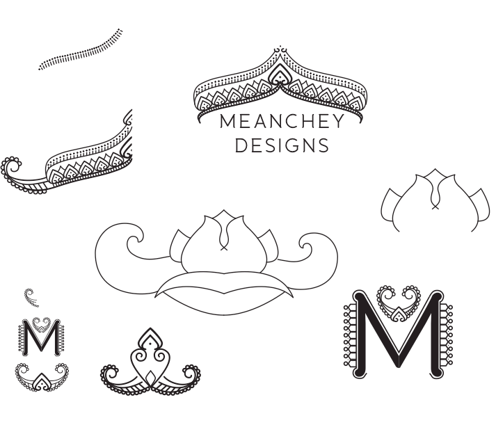
4. POLISHING Most of the time my client wants a million different versions of all the designs. Luckily this client liked one of the options when I showed them the picture above. So really polishing this time was just taking the logo they liked and putting it in different colors, line weights, with different type fonts, textures and ideas to try and flush out what kind of color palette and style they want. Like this:

The below image is the logo they went with. I do not reeeaaaalllly like this logo. I don't think it's awful, but I don't love it at all. This logo is not for me. It's for my client. They like it. They think it will sell lots of pretty things. That's very important.
Take Away: in the end, it's not what you want, but what the client wants that matters.

Apple Exploits Nepali Migrant Workers
I worked on this story for Bloomberg News while I was in Kathmandu last year. The topic needs much more coverage and so much more action. I have heard reports of at least one Nepali corpse coming into the airport per day from Qatar. It's slavery. And it's worldwide. I'm quite clueless when it comes to international law, but it's obvious that some type of international regulation needs to be in place for migrant workers around the world.
I use an iPhone; I'm writing this on one of my two Mac laptops. It's obvious Apple holds their product design to an incredible high standard. That standard should be reflected in their international labor regulations.
Bibek is just one of millions who are abused and enslaved daily so that we can use our iPhones, computers and other gadgets.
Here in Cambodia, It's not just labor that is being sold. It's women, children and it's horrific. When will this become a major issue for governments around the world? When will international standards be implemented?
Here are some ways to help and become aware.
- http://www.notforsalecampaign.org/
- http://edition.cnn.com/interactive/2013/12/world/cambodia-child-sex-trade/index.html
- http://www.halftheskymovement.org/?gclid=CL7_4oqlnbwCFZRr7Aod4EQAtQ
- http://www.endslaverynow.com/
- http://www.iloartworks.org/forced-labour/end-slavery-now/
- https://www.freetheslaves.net/sslpage.aspx?pid=328
